Just amazing...choreography..and ...something. I don't know what they call it, advanced puppetry?
Brilliant. I didn't realize how innovative and creative they are.
And... new video too. I'm gonna have to buy this, I think. Pretty...visual, I'd say.
"Tonight when I pull my pantyhose out of their egg, I'm gonna fined me that man, a man that smells like cocoa butter and cash!"
Monday, August 30, 2010
Amazing video
Scissor Sisters- love how this video is literally the credits of the video, presented as opening credits to a movie. Very Bond -esque. Clever.
Wednesday, May 19, 2010
Saturday, May 8, 2010

Friday, April 30, 2010


i took some more photos today

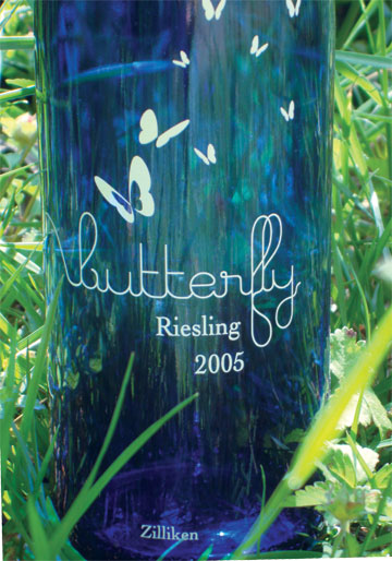
out in the shade, behind the house. I was aiming for a "natural" setting, since the brand of the wine is butterfly.
How do they look?

Tuesday, April 27, 2010
how does this look?

I am trying to make a board with photos of the wine bottle. I do not want to bring it in, I know I am clumsy, and I will get nervous and drop it. It's fragile enough already w/out me messing it up more.
Thursday, April 22, 2010

Wednesday, April 21, 2010
a touch up

I dunno why I did it, but it took about 20 min to do it. At leat I found the signage files I thought I had erased.
Sunday, April 18, 2010
Because i just have to beat a dead horse.

I will not let this hold me up, this will not be another shitty darfur poster, I am determined to fix this. And while I do not feel so hot about it now, I do think it is a vast improvement over that horrid blue gradient.
Sleeve for lizzy

This is my proposed sleeve for the cd, its a sleeve(duh) that will slide off, in the upwards direction. the water part at the bottom will be cut away.
Saturday, April 17, 2010

Thursday, April 15, 2010


Monday, April 12, 2010

Sunday, April 11, 2010
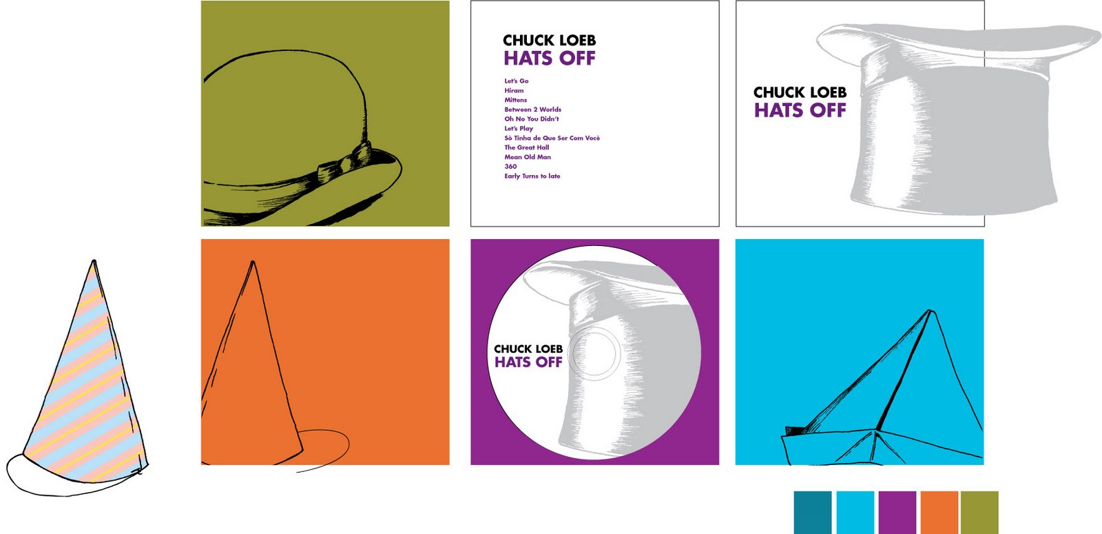
chuck, so far.


So my title for his will be" Hat's off" . I love it. Can't settle on a cover though, I really like the one with the small hat below the type.
Tuesday, April 6, 2010
Monday, April 5, 2010
and chuck

more hats
I still cannot think of what to do with this, but I love these hats, they're fun.
Thinking of Lizzy

I will name it "growing up" . I think the title says a lot. I find with musicians, the second album is always something, like you have to prove yourself, or just in about how you go after the debut. The title" growing up" could represent lizzy as an artist, developing, growing up and doing it on her own and not with the help of daddy(which is an admirable thing, in my opinion).
I would like the cd packaging to open up, long ways, like growing taller. The background will be a old picket fence of sorts, covered with vines, flowers and some bees, ants, etc. Kind of like "an old soul" growing. The circle is how I want the dosc to look, a flower. There will be other flowers, vines, etc. This is a rough of what I want. I would like the vines to possibly be silhouettes, filled with some texture with a wash-like look. The flowers and bugs will be in detail, as will some of the details on the fence. Once opening up the fold, the inside will have credits and such, along with a holder for the disc.
Thursday, April 1, 2010


Wednesday, March 31, 2010


Monday, March 29, 2010
on a saturday, to boot.
Thank you for signing up for this event!
Thank you for signing up for this AIGA Atlanta event. Your registration information is below.
Michael Rogers
Marietta, GA 30008
Event: Student Portfolio Day 2010
Date : Saturday, April 17
Time : 11:30 AM
Cost : $30.00
Transaction Reference Number : VXHA5A26D621
Thank you for signing up for this AIGA Atlanta event. Your registration information is below.
Michael Rogers
Marietta, GA 30008
Event: Student Portfolio Day 2010
Date : Saturday, April 17
Time : 11:30 AM
Cost : $30.00
Transaction Reference Number : VXHA5A26D621
silkscreen vid
This is how I imagined Justin would make a vid for this. Was helpful to me, explained it waaaay better than the darn Speedball manual.
Saturday, March 27, 2010
Lizzy+ Chuck

So for Lizzy, I am thinking of something like " love for sale". My idea is for the cd to appear like an old catalog, but the items for sale would be non corporeal things, like Love, Integrity, Morality, Conscience, etc...
Either that, or the song titles could be the things for sale(my muse, James, etc.)
As for Chuck, i keep thinking hes a man with many hats. What if I produce some for of image, out of hats? Like a blossoming flower, huge, open. Or maybe The handle of a guitar, but the tuning knobs (is that what they are called?) are hats? As for a title, I am not certain, somethign with a eference to hats. I will think on that...
Friday, March 26, 2010
to space or not to space
that is the question.
I think I have spent far too much time on this, I need to get rolling onto other things. But Ive been really happy with this. I have stared at it so much, it's hard to tell if its readable anymore.
finished logo
And bam! there it is. I will keep "the design fancy of" for web use. It will drop off for business card, letterhead, and such. I am pretty happy with it, thought i am considering going back to the vector version.
Thursday, March 25, 2010
hmm...
so the alphabet is finished, drawn, scanned, etc.
Now how does it look? i am not sure if the clean,polished vector is better or not.
Wednesday, March 24, 2010

amazing free app for designers.
It tracks your mouse movements, clicks, etc. And generates artwork based from it. Looks really neat.
iographica.com
Lots of images on Flickr showing what it can do.
And... www.notcot.org... very much like ffffound.com
informationisbeautiful.net great source for info design and really nice examples.
iographica.com
Lots of images on Flickr showing what it can do.
And... www.notcot.org... very much like ffffound.com
informationisbeautiful.net great source for info design and really nice examples.
the alphabet, vector-wise

is now finished. Now, to print them all out, trace them, and scan back in. if it doesn't 'work' I will resume with the vector versions. We shall see.
Monday, March 22, 2010

so this is what I am aiming for....

Honestly, I think I am really digging this. is this better, readability wise? I have been staring at it for so long, I cannot tell anymore.
The drawn stuff is mostly a placeholder, I doodled them quick to scan them in and see how they would look, I think the curvy, organic lines compliment the blocky-ness of the typeface.
Friday, March 19, 2010
identity crisis, the usual.

so..I started these letterforms. I made them in Illustrator, now I want to print them out, trace them by hand, and scan them back in. But the treatments are how I think I will brand myself. I am really set on black/white/gray. But surprisingly, I am a little fond of something bold and adventurous like black /white/hot pink. It's fancy, I know. I may actually use helvetica too! It's crazy, I know. I also intend to draw some of those organic vine thingys I have been obsessed with as of late too, to come out of the letters/name. Any thoughts?
Wednesday, March 17, 2010
others i forgot
www.djeco.com i like the look of this, very colorful
www.tracychapman.com not a fan, but really love the look of this site, and the interaction.
www.tracychapman.com not a fan, but really love the look of this site, and the interaction.
Tuesday, March 16, 2010
some nifty portfolio sites
www.lotie.com
http://www.laszlo-kovacs.com/
http://www.albertocerriteno.com/index.html
http://www.aaronbaggio.com/
http://www.laszlo-kovacs.com/
http://www.albertocerriteno.com/index.html
http://www.aaronbaggio.com/
Thursday, March 4, 2010
list of sign materials
http://www.signwave.com.au/sign-materials.html
This is what I was looking for.
This is what I was looking for.
Wednesday, March 3, 2010

Monday, March 1, 2010
more workin with the vectors

Kinda cute, very much inspired by James Jarvis, after readin his article/interview in this month's Juxtapoz
Saturday, February 27, 2010
experimenting with vector art

Keep seeing stuff like this in my dreams, and No matter how much I sketch it, it doesn't "look" right, so I decided to try it out in all vector, and I never do that, really...but here it is.
Thursday, February 25, 2010
wondersignage

Now, to take care of the interior/main entry ay signage/look, and organize it all more on boards
Tuesday, February 23, 2010


Tuesday, February 16, 2010
wonderroot sign ideas


I was thinking of possible signs for the various studios they have there.
Possible needed signage:
*Outdoor sign next to the building, so you can see it and not pass by.
My goal for this outdoor sign might be cut out of the material, maybe with some lights below it.
*Directionals, because the area i checked seems kinda odd, you might miss it.
*Possible t-shirts, for events and staff. Screen printed to keep with the handmade look.
*Signs for the studios.
*Maybe some vehicle signage.
*And signs for parking, that needs some help.
Friday, February 12, 2010
Tuesday, February 9, 2010
for Nathan
This song and video always make me think of Nathan, i don't know why.
http://www.youtube.com/watch?v=5VPyso87fZU
Mute records is finicky, they will not allow embedding.
http://www.youtube.com/watch?v=5VPyso87fZU
Mute records is finicky, they will not allow embedding.
Monday, February 8, 2010
A doodle gone awry

I think I like the one on the left more, the one on the right almost looks like a creepy face.
Saturday, February 6, 2010


Subscribe to:
Posts (Atom)